Kurasu
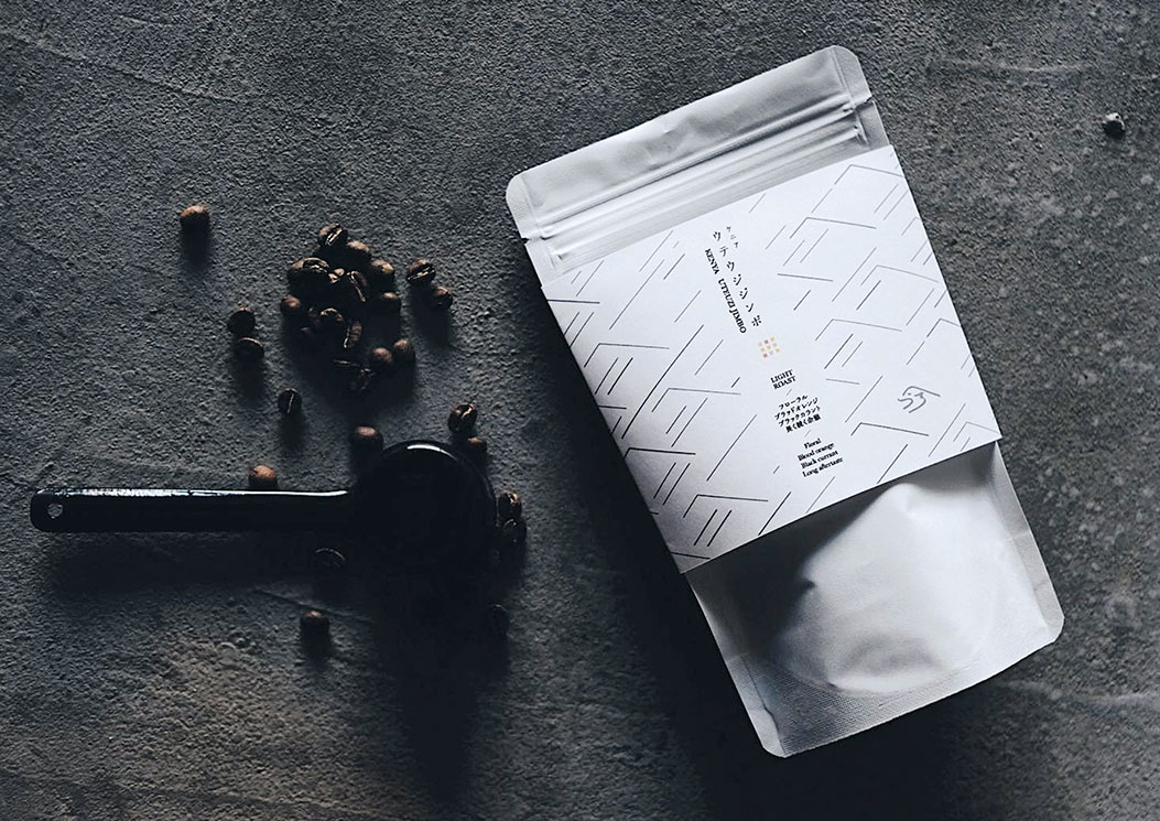
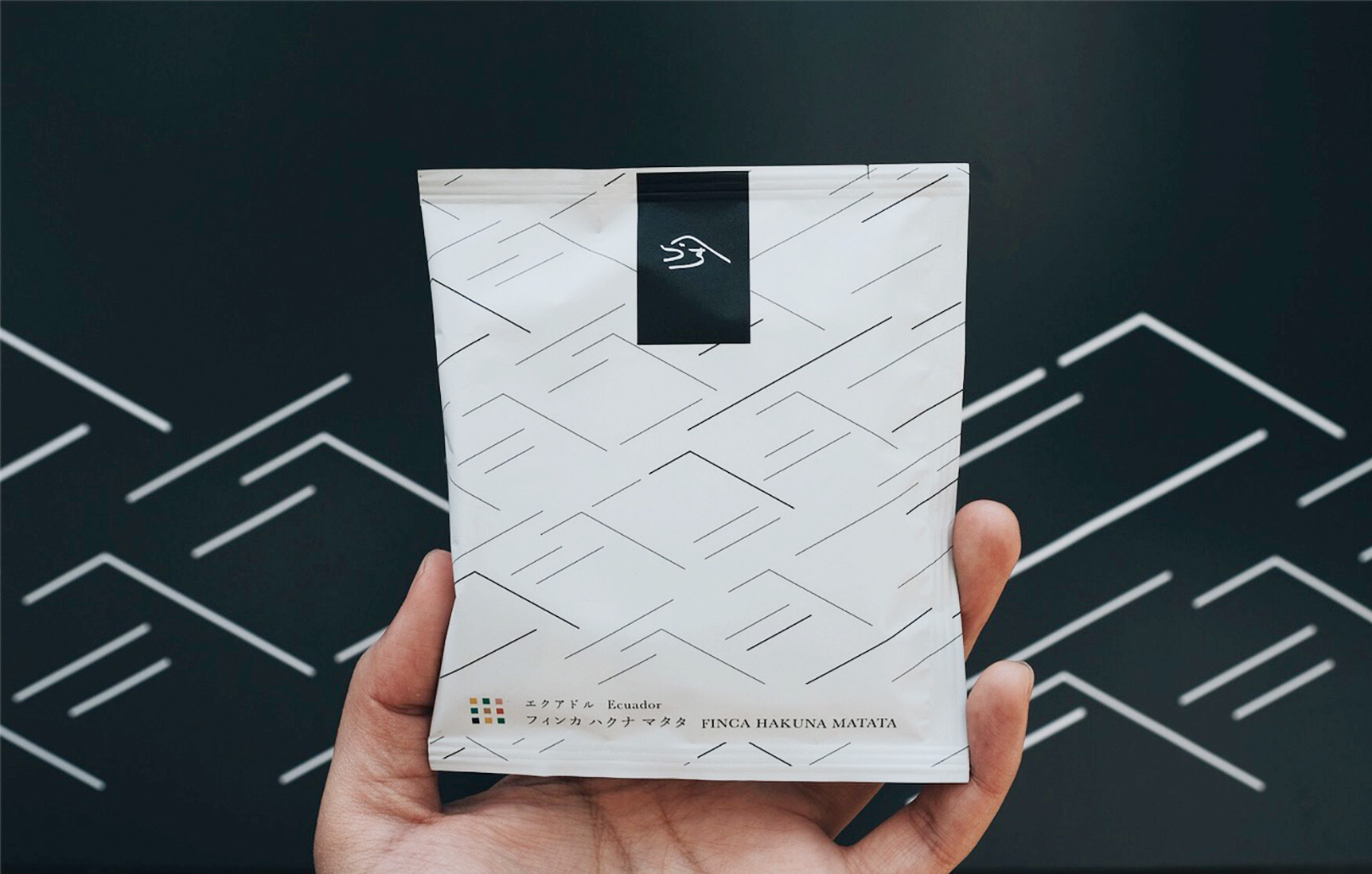
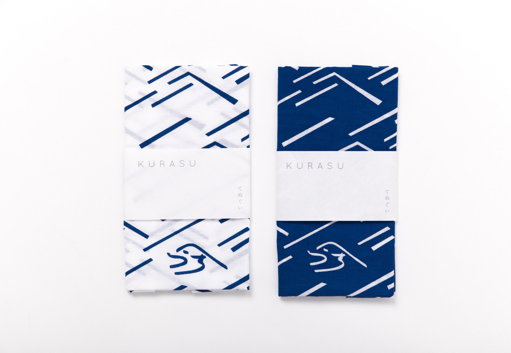
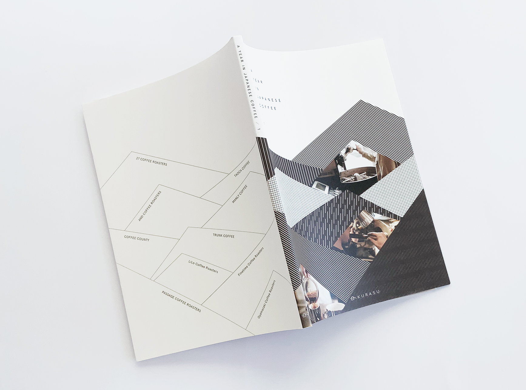
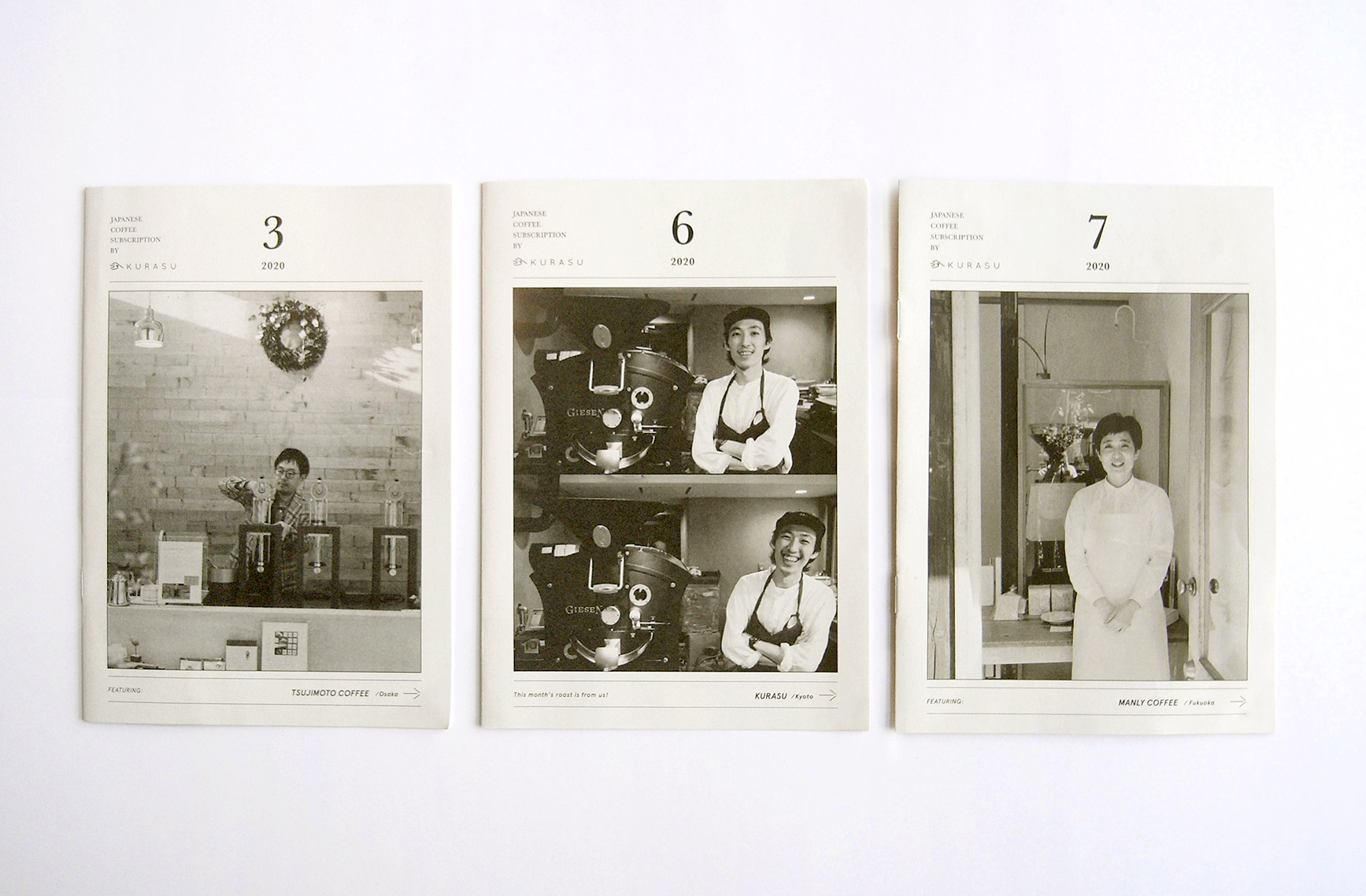
Visual identity development for a specialty coffee roaster/cafe that matches the existing logo. The shape of logo is inspired by the mountains and rivers in Kyoto where the cafe serves its community. The minimalistic line pattern is created based on this logo concept. The line feature and minimalistic look is applied throughout their brand assets such as packaging and merchandise.
Year: 2018
Client: Kurasu